
How we built a login page where the password cuts a key
A React login page that turns the password into a brass key as you type: the hash behind the cuts, the SVG that animates them, and the mistakes we made first.
7 min read
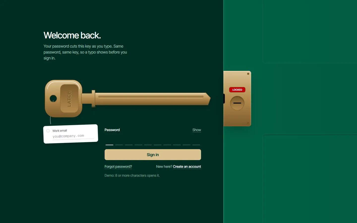
Almost every login page is one of a few things: a card on a gradient, a split screen with a photo, or a mascot that covers its eyes while you type. We wanted one where signing in is the object on the page. So the password cuts a key. Each character you type cuts the next notch in a brass blank, and signing in slides the key into a door.
It is not only decoration. The same password always cuts the same key, so after a few sign-ins you know the shape of yours. Type one wrong character and the key looks wrong before you press the button, without the password ever being shown.
The cuts are a chained hash, not the characters
The obvious version maps each character to a depth. That leaks too much: anyone looking at the screen learns something about every character. Instead, each cut's depth comes from a hash of everything typed so far. We use FNV-1a, a small public-domain hash, and take the result modulo four for the depth.
- The same password always produces the same ten cuts.
- One wrong character changes every cut after it, so a typo early in the password is very visible.
- No single cut tells you which character made it.
- A password longer than ten characters wraps around and re-cuts the same notches.
src/registry/login/cut-key/key-profile.ts
// A key has ten cuts along its blade, each one of four depths (0 is an uncut blank).
export const CUT_COUNT = 10;
export const MAX_DEPTH = 4;

// The key drawing's own units: 560 wide and 160 tall, with the blade's axis on the middle line.
export const KEY_VIEW = "0 0 560 160";
export const BLADE = { left: 160, top: 62, bottom: 100, shoulder: 505, tipX: 520, tipY: 78 };
const FIRST_CUT_X = 190;
const CUT_PITCH = 30;
const CUT_HALF = 13;
const FLAT_HALF = 4;
const DEPTH_STEP = 5;

// FNV-1a, the small public-domain hash: enough to turn text into an even spread of depths.
const HASH_SEED = 2166136261;
const HASH_PRIME = 16777619;

// The cuts a password makes. Each character cuts the next position along the blade (wrapping after ten), to a depth
// taken from a hash of everything typed so far. So the same password always cuts the same key, one wrong character
// changes every cut after it, and no cut says which character made it.
export function cutDepths(password: string): number[] {
  const depths = new Array<number>(CUT_COUNT).fill(0);
  let hash = HASH_SEED;
  [...password].forEach((character, index) => {
    hash = Math.imul(hash ^ (character.codePointAt(0) ?? 0), HASH_PRIME) >>> 0;
    depths[index % CUT_COUNT] = 1 + (hash % MAX_DEPTH);
  });
  return depths;
}

// Where a cut sits along the blade.
export const cutX = (index: number) => FIRST_CUT_X + index * CUT_PITCH;

// The blade's outline for a set of cuts. It always has the same number of points, so one outline can spring into
// the next as a cut is made.
export function bladePath(depths: number[]): string {
  const cuts = depths
    .map((depth, index) => {
      const x = cutX(index);
      const y = BLADE.bottom - depth * DEPTH_STEP;
      return `L${x + CUT_HALF} ${BLADE.bottom} L${x + FLAT_HALF} ${y} L${x - FLAT_HALF} ${y} L${x - CUT_HALF} ${BLADE.bottom}`;
    })
    .reverse()
    .join(" ");
  return `M${BLADE.left} ${BLADE.top} L${BLADE.shoulder} ${BLADE.top} L${BLADE.tipX} ${BLADE.tipY} L${BLADE.shoulder + 7} ${BLADE.bottom} ${cuts} L${BLADE.left} ${BLADE.bottom} Z`;
}
One honest caveat: this is a visual fingerprint of the password, and it does give a shoulder-surfer a little information, in the same way that the row of dots gives away the length. It is fine for most products. For a bank, leave it out.
An outline that can spring from one shape to the next
The blade is a single SVG path. Motion can animate the d attribute from one path to another, but only when both paths have the same number of points. So the outline always draws all ten notches, four points each, even on a blank key. An uncut notch is four points lying flat on the blade's edge. When a character is typed, those points move up and the path springs to its new shape.
The rest of the key is drawn once: a squared bow with a stamped panel, a collar, a milled groove and a highlight along the top edge. The brass is one vertical gradient reused by every part, which is most of what makes it read as metal and not as clip art.
src/registry/login/cut-key/cut-key.tsx
"use client";

import { useId } from "react";
import { AnimatePresence, motion } from "motion/react";
import { SPRING_SNAPPY } from "@/lib/motion";
import { cn } from "@/lib/utils";
import { BLADE, bladePath, cutX, KEY_VIEW } from "./key-profile";

// The bow (the part you hold) with the hole its tag is tied through, and the neck and collar that stop the key at
// the lock's face.
const BOW = "M34 22 H90 a30 30 0 0 1 30 30 V108 a30 30 0 0 1 -30 30 H34 a30 30 0 0 1 -30 -30 V52 a30 30 0 0 1 30 -30 Z M30 69 a11 11 0 1 0 0.01 0 Z";
const NECK = "M118 64 H150 V54 H160 V106 H150 V96 H118 Z";
// Light catching the bow's top edge.
const BOW_SHINE = "M12 50 a24 24 0 0 1 24 -22 H88 a24 24 0 0 1 24 22";
const SHAVING_FALL = 44;

export interface Shaving {
  id: number;
  cut: number;
}

interface CutKeyProps {
  depths: number[];
  // A short word stamped into the bow, such as the brand.
  engraving: string;
  // Rolled edge-on in the lock: the cord and tag are let go.
  isTurned?: boolean;
  shavings: Shaving[];
  onShavingGone: (id: number) => void;
  className?: string;
}

// A brass key drawn in code: a squared bow with a stamped panel and an engraved word, a collar, and a blade with a
// milled groove. The blade springs to a new outline whenever a cut changes, and a sliver of brass falls from each
// fresh cut. A cord leaves the hole in the bow for the tag that hangs under it.
export function CutKey({ depths, engraving, isTurned = false, shavings, onShavingGone, className }: CutKeyProps) {
  const brass = useId();
  const stamped = useId();
  return (
    <svg aria-hidden viewBox={KEY_VIEW} className={className}>
      <defs>
        <linearGradient id={brass} x1="0" y1="0" x2="0" y2="1">
          <stop offset="0" stopColor="currentColor" className="text-brass-light" />
          <stop offset="0.5" stopColor="currentColor" className="text-brass" />
          <stop offset="1" stopColor="currentColor" className="text-brass-deep" />
        </linearGradient>
        <linearGradient id={stamped} x1="0" y1="0" x2="0" y2="1">
          <stop offset="0" stopColor="currentColor" className="text-brass-deep" />
          <stop offset="1" stopColor="currentColor" className="text-brass" />
        </linearGradient>
      </defs>
      <path d="M30 86 C24 118 18 136 22 160" className={cn("fill-none stroke-white/50 transition-opacity duration-200", isTurned && "opacity-0")} strokeWidth="1.5" />
      <g fill={`url(#${brass})`} className="stroke-brass-deep">
        <path d={BOW} fillRule="evenodd" />
        <path d={NECK} />
        <motion.path initial={false} animate={{ d: bladePath(depths) }} transition={SPRING_SNAPPY} />
      </g>
      <rect x="52" y="36" width="56" height="88" rx="14" fill={`url(#${stamped})`} className="stroke-brass-deep/60" />
      <g transform="rotate(-90 80 80)" textAnchor="middle" className="text-sm font-bold tracking-widest uppercase">
        <text x="80" y="86" className="fill-brass-light/70">
          {engraving}
        </text>
        <text x="80" y="85" className="fill-brass-deep">
          {engraving}
        </text>
      </g>
      <path d={BOW_SHINE} className="fill-none stroke-white/55" strokeWidth="2" strokeLinecap="round" />
      <path d={`M164 ${BLADE.top + 3} H${BLADE.shoulder - 4}`} className="stroke-white/50" strokeWidth="2" strokeLinecap="round" />
      <rect x="170" y="71" width="328" height="6" rx="3" className="fill-brass-deep/55" />
      <path d="M173 78.5 H495" className="stroke-brass-light/80" />
      <AnimatePresence>
        {shavings.map((shaving) => (
          <motion.rect
            key={shaving.id}
            x={cutX(shaving.cut) - 4}
            width="8"
            height="2.5"
            initial={{ y: BLADE.bottom, opacity: 1, rotate: 0 }}
            animate={{ y: BLADE.bottom + SHAVING_FALL, opacity: 0, rotate: 80 }}
            transition={{ duration: 0.6, ease: "easeIn" }}
            onAnimationComplete={() => onShavingGone(shaving.id)}
            className="fill-brass"
          />
        ))}
      </AnimatePresence>
    </svg>
  );
}
One real password field under ten slots
The password is shown as ten slots, one under each notch. It is tempting to build that from ten inputs. Do not: ten inputs break pasting, autofill and password managers, and a screen reader hears ten unlabeled fields.
There is exactly one real password input. It lies over the whole row with transparent text and a transparent caret, and the slots underneath are drawn from its value. Typing, pasting, the browser's saved password and a password manager all behave as they would on any form, because to the browser it is any form.
src/registry/login/cut-key/cut-slots.tsx
"use client";

import { cn } from "@/lib/utils";
import { CUT_COUNT } from "./key-profile";

interface CutSlotsProps {
  id: string;
  label: string;
  value: string;
  onChange: (password: string) => void;
  isShown: boolean;
  onToggleShown: () => void;
  labels: { show: string; hide: string };
  isWrong: boolean;
  isDisabled: boolean;
  errorId?: string;
  // Where the row of slots sits inside its line, so it can be lined up under the key's cuts.
  rowClassName?: string;
}

// The password as ten slots, one under each cut of the key above. One real password field lies over the row, so
// typing, autofill and password managers work as usual; each slot shows the character that last cut its notch as
// a dot (or the character itself when shown), and the slot the next character will cut is marked.
export function CutSlots({ id, label, value, onChange, isShown, onToggleShown, labels, isWrong, isDisabled, errorId, rowClassName }: CutSlotsProps) {
  const characters = [...value];
  const next = characters.length % CUT_COUNT;
  return (
    <div>
      <p className="flex items-center justify-between text-sm">
        <label htmlFor={id} className="font-medium">
          {label}
        </label>
        <button
          type="button"
          onClick={onToggleShown}
          aria-pressed={isShown}
          className="rounded-sm text-emerald-100/70 underline decoration-white/30 underline-offset-4 hover:decoration-white focus-visible:outline-2 focus-visible:outline-offset-2 focus-visible:outline-white"
        >
          {isShown ? labels.hide : labels.show}
        </button>
      </p>
      <div className="relative mt-1 h-12">
        <div className={cn("absolute inset-y-0", rowClassName)}>
          <div aria-hidden className="grid h-full grid-cols-10">
            {Array.from({ length: CUT_COUNT }, (_, slot) => {
              // The last character typed at this slot: later rounds of a long password re-cut the same notch.
              const index = slot + CUT_COUNT * Math.floor((characters.length - 1 - slot) / CUT_COUNT);
              const character = index >= 0 ? characters[index] : undefined;
              return (
                <span
                  key={slot}
                  className={cn(
                    "mx-0.5 grid place-items-center border-b-2 font-mono sm:mx-1",
                    isShown ? "text-sm sm:text-lg" : "text-2xl sm:text-3xl",
                    isWrong ? "border-red-400 text-red-300" : slot === next && !isDisabled ? "border-white" : "border-white/25",
                  )}
                >
                  {character === undefined ? "" : isShown ? character : "•"}
                </span>
              );
            })}
          </div>
          <input
            id={id}
            type={isShown ? "text" : "password"}
            name="password"
            autoComplete="current-password"
            required
            value={value}
            disabled={isDisabled}
            aria-invalid={isWrong}
            aria-describedby={errorId}
            onChange={(event) => onChange(event.target.value)}
            className="absolute inset-0 size-full cursor-text rounded-sm text-transparent caret-transparent outline-none focus-visible:outline-2 focus-visible:outline-offset-4 focus-visible:outline-white"
          />
        </div>
      </div>
    </div>
  );
}
Turning the key without it looking broken
On submit the key slides right until its collar meets the door, then turns. The door is simply drawn above the key, so the blade disappears under its edge.
Our first version of the turn used a 3D rotation with perspective, and the key came out skewed, like a bent spoon. A key turning about its own axis, seen from the side, does not skew. It just gets thinner. Removing the perspective and rotating about the horizontal axis gives exactly that: the bow rolls down to a thin brass edge. On a wrong password the key twists a little twice, backs out, and the slots turn red with a message.
src/registry/login/cut-key/key-moves.ts
import type { TargetAndTransition } from "motion/react";
import { EASE_OUT } from "@/lib/motion";

export type KeyPhase = "idle" | "inserting" | "turning" | "open" | "jammed";

// How far the key travels to seat its collar against the door, as a share of its own length, and how far it rolls
// about its axis once seated.
const SEATED = "71.4%";
const TURNED = 80;
export const INSERT_MS = 700;
export const TURN_MS = 550;
export const JAM_MS = 900;

// What the key does in each phase. A jam is a short fight: it twists a little, backs out a little, twice.
export const KEY_MOVES: Record<KeyPhase, TargetAndTransition> = {
  idle: { x: "0%", rotateX: 0, transition: { duration: 0.5, ease: EASE_OUT } },
  inserting: { x: SEATED, rotateX: 0, transition: { duration: INSERT_MS / 1000, ease: EASE_OUT } },
  turning: { x: SEATED, rotateX: TURNED, transition: { duration: TURN_MS / 1000, ease: EASE_OUT } },
  open: { x: SEATED, rotateX: TURNED },
  jammed: { x: [SEATED, "69%", SEATED, "70%", SEATED], rotateX: [0, 16, 0, 11, 0], transition: { duration: JAM_MS / 1000 } },
};
What we got wrong first
- The first build was a small flat key and a black box above an ordinary form. The idea was there and the page was not. The fix was composition: a large key across the page, a door down the right side, the email on the key's tag and the password under the notches.
- The page was pale grey with a geometric font, which is nobody's choice. It became one deep green world with brass as the only bright thing.
- The headline was hero-sized. A login is not a hero: 30 to 36 pixels is plenty.
- Focused inputs had a heavy two-pixel ring. A hairline plus a soft halo reads as focus without shouting.
Using it
The component takes an async onSubmit that resolves true or false. True turns the key, false jams it. Every piece of copy is a prop, and all motion is skipped for visitors who ask for reduced motion.
More articles
8 min read
A scroll-story landing page in React: one pinned stage, one clockHow to build a pinned scroll story in React with Motion: sticky positioning, one scroll-driven clock, and a single object that changes state scene by scene.
5 min read
OTP input in React: use one real input, not sixSix separate boxes break paste, autofill and screen readers. Build a six-digit code input in React from a single input with the boxes drawn underneath it.